![]()

Phoenix Railway Photographic Circle
Est. 1970 - 71
|
|
Phoenix Railway Photographic Circle Est. 1970 - 71 |
|---|
| Creative Railway Photography |
|---|
Galleries |
Background |
Features |
Membership |
Contact Us |
| Have a Go |
|---|
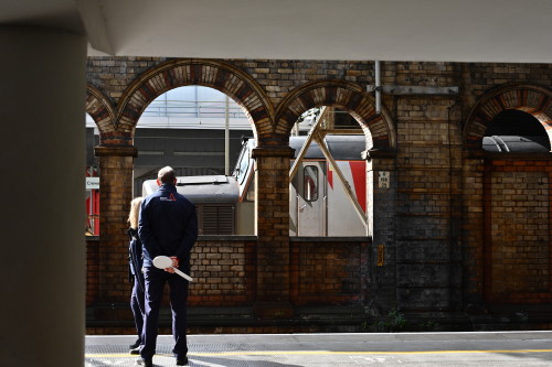
The question of image processing is a well discussed topic within Phoenix both in the Print Box circulation and on the quarterly Critique Galleries. Has the image been over processed? Does the image require more processing? Should the image be cropped to comply with the rule-of-thirds? As photography is subjective it is sometimes difficult to answer when comparing different images. So what about members being able to edit just one single image? How would they interpret what needed to be done to improve the image? More importantly what would the results be? Firstly we needed an image which was kindly supplied by Nigel a 'straight from the camera' j-peg which can be seen to the right. |
 |
'I adjusted the horizontals of the platform a little, with a view to getting the horizontal lines more level across the shot. |
 |
'Auto Correct for the uprights and levels (couldn't go full as it chopped the chaps ankles off) It may not be to everyones cup of tea but I quite liked it.' |
 |
'Like Terry, one of the first things I did was crop them out. Then I did much of what Terry did, however, I did not go quite as far. In Adobe Camera RAW, Highlights -100, Shadows +77, Whites +40, Blacks -40 and Clarity to +34. When I cropped out the ceiling, I did not want to have to crop out the top of that arch, which left a slim triangle shape of grey on the top right half of the picture. Not the neatest of jobs, but I cloned out the grey area including bricks. If it was my picture, I would have taken more time to do a better job of matching the brick work. With the basic picture done to my liking in Photoshop, I moved it into On1 Photo RAW 2020. I applied a sunshine filter to increase the warmth of the sunshine, increased the Dynamic Contrast and then applied a Vignetter. The big soft vignette was applied in such a manner to darken most of the shadows and unimportant areas on the right and highlight and surround the people in the picture. There is more that needs to be done to finish the picture. But, this shows enough to give the impression of what I would try to achieve. What still needs to be done? Increasing the Dynamic Contrast, highlighted all of the white reflective highlights making them white specks all over the image. Many of them I did fix, but there are still many more that need to be addressed.'
|
 |
| Richard had two bites at the cherry with a black & white and colour version supplied. 'The colour version: In lightroom (5) Colour temp +7, Contrast +38, Highlights -52, Whites +36, Blacks-12, Clarity +17, Vibrance +43, Red saturation -24. Then exported as tif file and opened in Photoshop elements 7 Correct horizontal perspective to level up the horizontals Lighten the clothing using an adjustment layer The change of perspective left a white gap at the bottom so a clumsy attempt to fill the space using the clone tool Crop - and decided to crop tightly even though it lost a lot of the interesting brickwork Sharpen using unsharp mas ( 100% 1.6 pixels, 0 threshold).'
|
 |
Scroll through the presets and select Fine art process Adjust to Brightness -1, Contrast +42, Structure +46 Selectively reduce brightenss in the area of the larger arch and increase brightness on the clothing and shadowy wall. Save as a Tif file. Open in Elements 7 – adjust horizontal perspective ( this time I cant be bothered cloning into the “white space” and just crop leaving more of the wall. ( the bracket supporting overhead line gear isn’t so obtrusive in B&W).'
|
 |
| Rod was next to submit going for a 2 arch crop simialr to Richard's B&W version processed in the same vain as Charlie's earlier version. |  |
The sixth interpretation received was from Andrew he writes :- 'Edit’s made in Lightroom, I have mainly used separate brushes to lift the shadows, highlights and clarity on the two despatchers, I’ve dropped the saturation, clarity and blacks in the wall to try take your eye from the despatches through to the locomotive, which I’ve lifted the clarity and shadows but also just cooled down the colour a little.'
|
 |
Martin was the final member to supply his version. In fact he produced four versions! His actions are listed for each of them. 'Contrast +34, Colour Balance Yellow +12, Green +2, Cyan +2. |
 |
| 'Posterized, then brightness -150, contrast -50. A stark and very contrasty simplification.' |
 |
'Desaturated (to change from colour to black & white), Brightness +35, Contrast -3, Threshold level 128.
A fairly standard monochrome presentation.' |
 |
| 'Posterize Level 4; Levels reduced, then Brightness -26, contrast -7 . A bit of fun, with some exaggerated colour patterns.' |
 |
In the discussion that followed it was agreed this was a worthwhile experiment and that those who had taken part had enjoyed the experience. Thanks were extended to Nigel for providing the image. |
Follow us on Flickr and Facebook
|
|---|
| Click on the Button |  |
 |
|---|
Reproduction, transmission or storage in any form without permission is expressly forbidden.
For permission to use any of the images displayed on this site please contact us via Facebook or e-mail the Webmaster.